
Uncover Your Signature Color
People that are passionate about color live, eat and breathe it—from their wardrobe to their walls, from plate to palette. Even if you’re not a hue enthusiast, you cannot resist its influence. It’s been shown that blue enhances your creativity, and red increases your attention to detail. Happier people prefer yellow to grey, and the color green can reduce your anxiety. Color holds value, and you can leverage this to impact your brand personality.
Be Strategic
While re-branding our own company, we’ve put our palette process to the test. We went through a few rounds of: “Fuchsia looks amazing with this!” and “I am loving orange right now!” before we got to: “Does it help us communicate our brand?” and “Will this authentically convey our vibe, across all of our platforms?”.
Revitalizing an 18-year old business is a challenge we collectively approached. Not only did we each create “mood boards” to reflect our agency vision, but we presented our concepts to the team after writing the Brand Strategy and before establishing creative direction for the visual identity. After writing the brand strategy, we collected our visual inspiration and made up three different palettes. This is what we considered in the process:
Consider Brand History
When evolving a legacy brand like Project X, it’s important to honor its history. Since its founding, Project X Media has rocked a bold combo of red and black. This palette portrays power, strength, and masculinity. Since we were aiming for a different set of attributes (integrity, transparency, creativity) we kept the color concepts, but shifted to more sun washed hues that better reflect our new brand personality and values.

Project X Media Logomark
Define Your Brand Personality
Created to guide brand decisions, a comprehensive Brand Strategy articulates the company’s aspirational personality—including product experience and emotional benefits. To help express the strategy, we all made mood boards with images and colors that inspire us, and directly reflect our brand personality. We made sure that our new identity evoked the feelings that authentically reflect our brand identity: confidence, optimism, bravery, curiosity and trust.
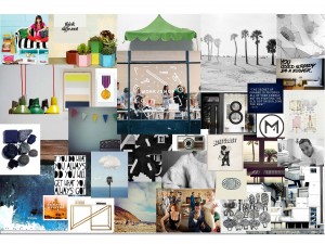
Creating a board of images helps communicate your brand personality.
Be Authentic
The secret sauce for a perfect palette comes from your unique point of view—what you see, what you wear, where you go. While this is identified in every Brand Strategy as the “brand personality”, it’s important to take it a step further and walk it through, to ensure that your are expressing your brand in the most genuine way. This will connect with your audience, building trust and value—which in turn, leads to increased revenue.
Where do you take clients for lunch? What music do you listen to in the office? What’s your dress code? What kind of table are you working at? WHAT’S YOUR VIEW? From our airy studio in an old warehouse near the harbor in downtown San Diego, we are rewarded with gasp-worthy sunsets daily–a major inspiration. We also gathered insight from pop culture, design, food, fashion, art and music. This contributed to our brand’s authenticity and supported the core themes of our new identity.

The new brand palette is directly inspired by San Diego’s signature sunsets–as seen from our studio in Little Italy.
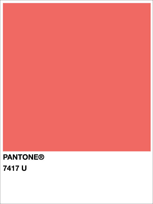
Finally, TEST your selections, and establish a color hierarchy. We originally gravitated to key colors in the sunset image—deep blue, warm red, and sunshine yellow—which felt modern to us, but a little too primary. We narrowed it to the juicy ruby grapefruit hue—which is tempered softly with cool neutrals like grey and white, reflecting a perfect brand evolution from the original red and black logomark.
-SB